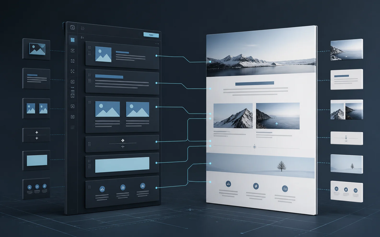
A WordPress site can look excellent to visitors and still be frustrating to maintain. When the editor does not resemble the frontend, content teams publish by guesswork. When every control is available everywhere, routine changes can break layout. When the system is too rigid, editors work around it.
The editor experience is part of the product. It should communicate the design, preserve important constraints, and make common publishing tasks predictable. Building it carefully improves both the quality of the site and the speed of future work.
Aim for Visual Parity
Editors should recognize the page they are changing. Typography, color, spacing, content width, buttons, cards, and responsive groupings should be represented inside the block editor as accurately as the platform allows. Exact parity at matching canvas widths is a better target than a loose approximation.
Shared editor styles are more reliable than a second, manually maintained design system. When the same tokens and component rules drive both surfaces, a frontend refinement is less likely to leave the backend behind.
If an editor cannot predict the published result, the interface is asking them to perform visual QA on every save.
Model Content Before Styling Blocks
Start with the information that needs to be managed. A project may have a title, summary, role, services, technologies, gallery, and walkthrough. An article may have a topic, excerpt, featured image, and reading structure. Model those fields and relationships before deciding how the frontend should arrange them.
Structured content can still support expressive design. The important distinction is between a flexible system and an unbounded one. Editors should have meaningful choices, not every possible choice.
Use Native Blocks and Purposeful Patterns
Native and registered blocks keep content visible to WordPress, portable across templates, and editable without proprietary markup. Reusable patterns can provide a strong starting point for complex sections while preserving individual content ownership.
A useful pattern should explain itself through its name, preview, block labels, and sensible defaults. Avoid creating ten nearly identical patterns whose differences are unclear. Prefer a smaller vocabulary of well-tested sections that can be combined intentionally.
- Use clear block names: “Project Gallery” is more useful than “Group 14.”
- Provide representative defaults: editors understand a pattern faster when its structure is visible.
- Lock structural relationships: protect wrappers and required elements while leaving content editable.
- Limit irrelevant controls: remove options that do not belong to the design system.
- Keep media replaceable: images, captions, and alt text should remain easy to maintain.
Constrain the Right Things
Constraints should protect decisions that matter: heading hierarchy, contrast, spacing rhythm, card proportions, required labels, and responsive behavior. They should not prevent an editor from correcting a sentence, replacing an image, reordering a legitimate item, or adding a supported entry.
Template locking, block supports, allowed-block lists, custom fields, and validation can all help. Use the lightest mechanism that makes the safe path obvious. A system that constantly fights its editors will eventually be bypassed.
Design for Content That Changes
Interfaces are often tested with ideal copy. Real content includes long names, short excerpts, missing images, unexpected links, and lists with uneven lengths. The editor should reveal those conditions before publication, and the frontend should handle them without collapsing.
Test components with realistic extremes. Check how a heading wraps, how a card behaves without a thumbnail, how a gallery responds to portrait media, and how buttons handle longer labels. Empty states should be intentional in both the editor and frontend.
Respect Accessibility in the Authoring Flow
Accessibility is easier to maintain when the editor supports it. Preserve heading order, expose alt-text fields, keep link purpose understandable, avoid autoplay, and provide clear labels for interactive components. Color controls should not make low-contrast combinations easy to publish.
The editing canvas also needs usable focus states, readable text, and controls that work with a keyboard. Backend accessibility is not separate from the quality of the finished site. It affects the people responsible for keeping that site accurate.
Validate Save and Reload Parity
A block that looks correct before saving can still serialize incorrectly, lose attributes, or change after reload. Test the complete path: insert, edit, save, reload, preview, and publish. Compare the editor and frontend at the same effective width instead of assuming a desktop editor canvas represents the public desktop layout.
- Confirm that every visible field survives save and reload.
- Compare typography, spacing, width, alignment, and interaction states.
- Test desktop, tablet, and mobile breakpoints in both contexts.
- Verify keyboard behavior and reduced-motion preferences.
- Check that reusable blocks and patterns update only where intended.
Document the System in the Interface
Good training begins inside WordPress. Descriptive pattern names, block labels, field instructions, and purposeful defaults reduce the need for a separate manual. Documentation is still valuable, especially for publishing workflows and release checks, but the interface should carry as much guidance as possible.
When the editor experience receives the same attention as the frontend, the website becomes easier to operate and harder to accidentally damage. That is not extra polish. It is part of building a maintainable WordPress system.